library(yardstick) # two_class_example is from yardstick
library(ggplot2)

two_class_example |>
  conf_mat(truth, predicted) |>
  autoplot(type = "heatmap") +
  scale_fill_gradient(low = "white", high = "lightblue") +
coord_equal()Introduction
Recently, I was developing a model to predict a binary outcome. I settled on a logistic regression model since that was something I was somewhat familiar with from my Econometrics class. From a logistic regression model you estimate the probability of the observation belonging to the positive class. As one would guess, a probability greater than 50% would indicate the positive class, and below 50%, the negative class. This is the threshold value; the threshold where the classification changes from one outcome to the other.
\[ \hat{y_i} = \begin{cases} p(x_i) \geq t, &\text{then } 1 \\ p(x_i) < t, &\text{then } 0 \end{cases} \tag{1}\] where \(t\) is the threshold value and \(t\in[0,1]\).
Problem
However, the response variable was quite imbalanced; about 75% of one class and 25% of the other.1 In checking the fit I noticed the model was overestimating the majority class. This was problematic as the objective was to build a model that would form an accurate estimate of the total number (or proportion) of positive cases while looking at each individual in the sample. The individuals estimated to be in the positive class would then be used for further estimation, but that is not the point of this exercise.
1 The example data I’ll be using is slightly imbalanced, 51.6%.
When I had come across this situation in the past I tried varying the threshold value manually to manipulate the quantity of positive classifications. This worked okay, but was cumbersome and annoying. I thought that there must be a better way to determine the threshold.
My second attempt to solve this issue came in the form of weights By manually adjusting the weight for misclassification along with the resulting confusion matrix, I would attempt to balance the quantities of errors so that the overall prediction prevalence of the positive class was similar to the training data. This again worked okay for my purposes, but I knew there still had to be a better way.
Solution
I messed around with adjusting a few methods for handling imbalanced classes, but none of them seemed to help.
The objective was to neither over- or underestimate the number of positive cases. Another way of saying that is that I need to have the same number of Type I (false positive) and Type II (false negative) errors.
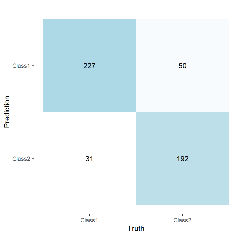
Looking at a confusion matrix (Figure 1), taking Class 1 as our positive class, we have the number of Type I errors in the top-right and the number of Type II errors in the bottom-left.
While reading through the documentation for {yardstick}, I came across Precision-Recall (PR) Curves (pr_curve). What is convenient about this curve is that it checks the precision and recall for each unique probability found in your dataset. This ends up being very useful for us. To see how we have to look at the definitions of precision and recall.
Precision and Recall
There are many different websites that provide a definition for these metrics. You can easily find several detailed explanations with a quick search.
\[ \begin{split} \text{Precision}&= \frac{\text{True Positive}}{\text{True Positive}+ \text{False Positive}} = \frac{TP}{TP+FP} \\ \text{Recall} &= \frac{\text{True Positive}}{\text{True Positive} + \text{False Negative}} = \frac{TP}{TP+FN} \end{split} \tag{2}\]
If we rearrange these definitions to solve for \(FP\) and \(FN\), we can make some progress.
\[ \begin{aligned} \text{Precision}\cdot(TP+FP) &= TP \\ (TP + FP) &= \frac{TP}{\text{Precision}} \\ FP &= \frac{TP}{\text{Precision}} - TP \\ FP &= TP \cdot \left(\frac{1}{\text{Precision}} - 1\right) \end{aligned} \tag{3}\]
The same algebraic process can be done for recall which gives,
\[ FN = TP \cdot \left(\frac{1}{\text{Recall}} - 1\right) \tag{4}\]
Now looking back to our objective, to make the quantities of Type I and Type II errors equal, we should set \(FP\) and \(FN\) equal to each other.
\[ \begin{aligned} FN &= FP \\ TP \cdot \left(\frac{1}{\text{Recall}} - 1\right) &= TP \cdot \left(\frac{1}{\text{Precision}} - 1\right) \\ \frac{1}{\text{Recall}} &= \frac{1}{\text{Precision}} \\ \text{Precision} &= \text{Recall} \end{aligned} \tag{5}\]
So we see that our error types will be equal in quantity when our precision and recall are equal.
PR Curve
Now that we know what we want to achieve, we have to write the code to do it.
Using pr_curve, we will shortcut a search of the possible threshold values ranging from zero to one.
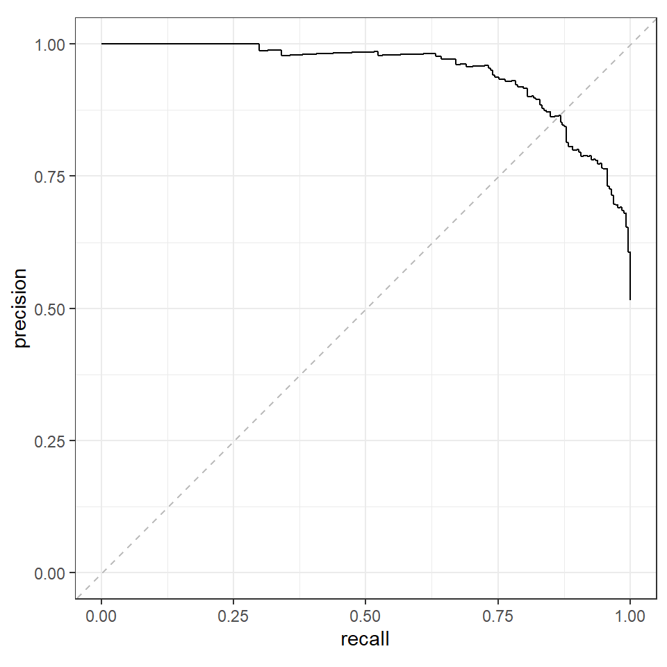
We can plot the curve to find the point where precision and recall are equal.
autoplot(pr) +
geom_abline(slope = 1, intercept = 0, color = "grey", linetype = "dashed")We see that precision and recall are equal along the dashed line and this meets the PR curve at about (0.85, 0.85). The exact point would be available in pr.
pr_diff <- pr |>
  mutate(diff = abs(precision - recall)) |>
  arrange(diff)

head(pr_diff)
#> # A tibble: 6 × 4
#>   .threshold recall precision    diff
#>        <dbl>  <dbl>     <dbl>   <dbl>
#> 1      0.610  0.864     0.864 0
#> 2      0.618  0.860     0.864 0.00335
#> 3      0.602  0.868     0.865 0.00335
#> 4      0.601  0.868     0.862 0.00668
#> 5      0.618  0.857     0.863 0.00669
#> 6      0.590  0.868     0.858 0.00998

threshold <- pr_diff |>
  slice(1) |>
  pull(.threshold)
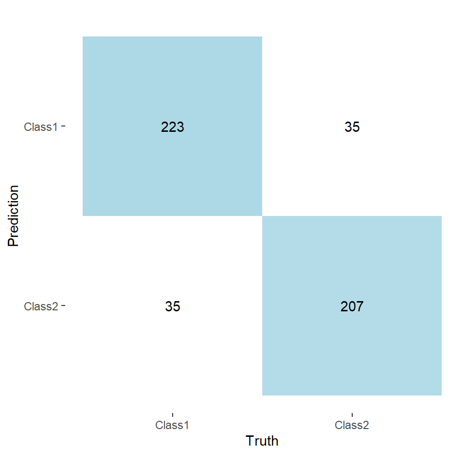
This tells us that a threshold of 0.61 will provide us with a balanced number of positive cases. We can check this my looking at the confusion matrix when we use 0.61 as the threshold.
two_class_adjusted <- two_class_example |>
  mutate(
    predicted_threshold = factor(
      if_else(Class1 >= threshold, "Class1", "Class2"),
      levels = levels(two_class_example$truth)
    )
  )

two_class_adjusted |>
  conf_mat(truth, predicted_threshold) |>
  autoplot(type = "heatmap") +
  scale_fill_gradient(low = "white", high = "lightblue") +
coord_equal()Notice how now the lower-left and upper-right quadrants have equal values. This means that the number of observations classified as Class 1 matches the amount in the training data.
However, this can come at the cost of reduced accuracy. Funnily enough this is not the case for this particular dataset, but it was for the dataset I was using.
library(tidyr)

two_class_adjusted |>
  select(truth, predicted, predicted_threshold) |>
  pivot_longer(
    cols            = c(predicted, predicted_threshold),
    names_to        = "threshold",
    values_to       = "predicted",
    names_transform = \(x) ifelse(x == "predicted", 0.5, threshold)
  ) |>
  group_by(threshold) |>
  accuracy(truth, predicted) |>
  select(threshold, accuracy = .estimate)
#> # A tibble: 2 × 2
#>   threshold accuracy
#>       <dbl>    <dbl>
#> 1     0.5      0.838
#> 2     0.610    0.86
Of course, in reality you would want to find the best threshold for each training set and average them to apply to the test set.


